How to Choose a Scarf Colour That Actually Suits You
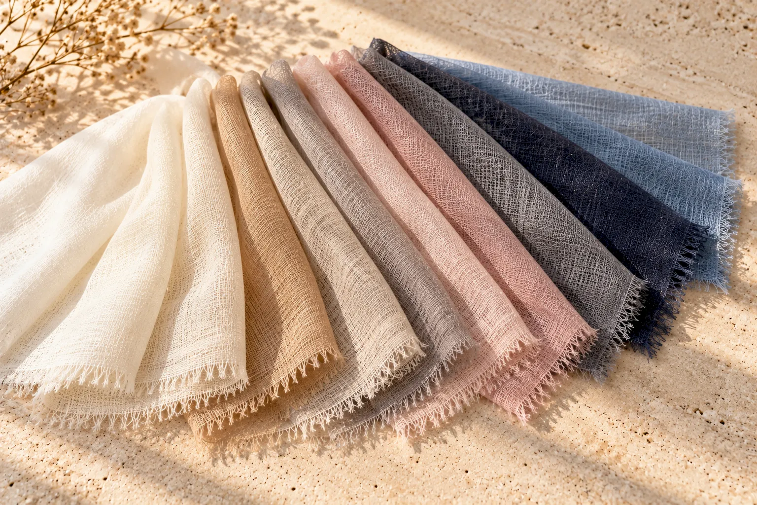
Colour choice is one of the most personal parts of buying a scarf, and also one of the easiest to get wrong without a simple framework to guide the decision. This guide sets out practical ways to think about colour, so your next purchase is one you will reach for often rather than one that sits unused because it never quite felt right.
Understanding Skin Undertone, Briefly
Skin undertone, the underlying hue beneath the surface colour of your skin, is generally categorised as warm, cool, or neutral, and it is a different thing from how light or dark your skin is. A simple way to get a rough sense of your own undertone is to look at the veins on the inside of your wrist in natural light: a greenish tint suggests a warmer undertone, a bluish or purplish tint suggests a cooler undertone, and a mix of both, or difficulty telling, suggests a more neutral undertone. This is an informal guide rather than a precise science, but it is a useful starting point.
Colours That Tend to Suit Warmer Undertones
If your undertone leans warm, colours with a golden, earthy or orange-leaning base, such as camel, warm rust, golden mustard, olive green, and warm chocolate brown, tend to harmonise well near the face, often appearing to brighten the complexion rather than compete with it. A warm-toned cream or ivory, rather than a stark, cool white, is often a more flattering neutral choice for warmer undertones specifically.
Colours That Tend to Suit Cooler Undertones
If your undertone leans cool, colours with a blue-leaning or pink-leaning base, such as navy, slate grey, soft lavender, true red, and deep burgundy with a blue rather than orange base, tend to work particularly well. A cool-toned, bright white or icy grey often reads as more flattering than a warm ivory for cooler undertones.
Colours That Work Well for Neutral Undertones
If your undertone is more neutral, you generally have the most flexibility, since colours from both the warm and cool groupings tend to work reasonably well. This is a genuine advantage worth recognising, since it means you can choose primarily based on personal preference, existing wardrobe, and occasion, without undertone constraining your options as much as it might for a strongly warm or cool complexion.
Colour Intensity and Contrast With Your Hair and Eyes
Beyond undertone, consider the overall contrast level between your hair, eye colour and skin tone. Someone with naturally high contrast, dark hair against fair skin, for example, often suits bolder, more saturated colours well, since these colours match the natural intensity already present in their features. Someone with a lower natural contrast, such as fair hair and fair skin together, may find that very muted, softer tones feel more harmonious than an intensely saturated colour, which can visually overwhelm a softer natural colouring.
Choosing for Versatility Versus Choosing for Impact
It is worth deciding upfront whether you want this particular piece to be a versatile, everyday colour that works with most of your wardrobe, or a more distinctive colour chosen specifically for visual impact on certain outfits. A neutral tone, grey, navy, camel, black or ivory, chosen within your flattering undertone range, will almost always see more consistent wear across more situations. A bolder, more saturated colour is wonderful for a second or third piece once you already have a reliable neutral to fall back on, as discussed in our guide to how many scarves you actually need.
How Lighting Changes How a Colour Reads
A colour that looks flattering under warm indoor lighting can look quite different under cool daylight or fluorescent office lighting, and vice versa. If possible, it is worth considering a new colour in more than one lighting condition before committing, particularly for an online purchase where you are relying on product photography that may have been shot under a single specific lighting setup. If you are uncertain, our guide to buying a cashmere scarf online covers how to evaluate colour and other details without being able to see the piece in person first.
Colour and Fibre Together
Different fibres render the same named colour somewhat differently. Silk's reflective sheen tends to make a given colour appear more vivid and luminous, while cashmere's matte surface renders the same colour more softly and subtly. If a specific shade matters a great deal to you, it is worth considering which fibre will present that colour the way you actually want, a point explored further in our comparison of silk and cashmere.
A Simple Process for Choosing Your Next Colour
- Identify your rough undertone using the wrist-vein check or by noticing which colours you already own and feel most complimented wearing.
- Decide whether you want a versatile neutral or a distinctive statement colour for this specific piece.
- Check the colour in more than one lighting condition if buying online, rather than relying on a single product photo.
- Consider your natural contrast level between hair, eyes and skin, and lean toward a more saturated or more muted tone accordingly.
When to Simply Trust What You Love
All of the above is a genuinely useful framework, but personal preference and emotional response to a colour matter too, and a colour you simply love wearing, even if it falls slightly outside your theoretically ideal undertone range, is still a valid and often very satisfying choice. Use this guide to narrow your options and avoid an obvious mismatch, not to override a colour you already know makes you feel confident.
Frequently Asked Questions
How do I find out my skin's undertone?
A simple informal method is checking the veins on the inside of your wrist in natural light. A greenish tint suggests a warmer undertone, a bluish tint suggests a cooler undertone, and a mix suggests a neutral undertone.
What is the most versatile scarf colour to own?
A neutral tone, such as navy, grey, camel or ivory, chosen within your flattering undertone range, tends to pair with the widest range of outfits and occasions.
Does the same colour look different in silk versus cashmere?
Yes. Silk's sheen tends to make colours appear more vivid and luminous, while cashmere's matte surface renders the same colour more softly and subtly.
Should I always choose a colour that matches my undertone?
It is a useful guide, not a strict rule. A colour you genuinely love wearing is still a valid choice even if it sits slightly outside your theoretically ideal range.
Why does a scarf colour look different online than in person?
Lighting conditions affect how colour is perceived, and product photography is often shot under a single specific lighting setup that may not match how the colour looks in your own daily environment.
Find Your Colour
Browse our full collection across cashmere, merino wool and silk to find the shade that suits you.